Turn data into actionable information
The information era is not about providing users with new databases tools, it’s about making data meaningful
A difference exists between data and information that is worth knowing about.
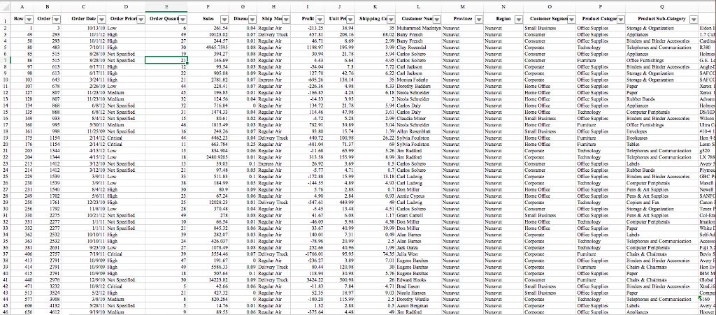
Data is what you find in an Excel sheet, SQL table, CSV file, etc. Most of the time it’s represented in a tabular form:
In contrast, Information, is the meaning that one gives to that data. It’s important to understand that the meaning only exists in our brain. In other words it exists for the person who looks at the data. In systemic analysis one says that information is a link between the person and the data (see footnote 1).
An important consequence is that the same data table (say, your Excel file) will convey different information to different people. Not only because it contains lots of columns and lots of lines, also because it tends to be interpreted differently by every person who looks at it.
From data to shared information
While it was not straightforward 15 years ago, these days everyone can create a spreadsheet or database online. Various Software-as-a-Service and No-code tools allow doing that in less than 20 minutes (see footnote 2).
Yet, the challenge is no longer there. For leaders, managers, consultants and teams alike, an important challenge is to turn data into shared information, and to use the latter as a leverage for team alignment and action.
Turning data into shared information might look simple at first glance. You could document the intended meaning of data with full sentences in natural language, for instance, and make sure everyone reads it (ah ah).
From experience though, it’s way more effective to discuss data together:
- Take the simple habit of displaying (raw) data during team alignment meetings.
- The differences of interpretations will pop up naturally and trigger interesting discussions.
- These discussions will build a shared understanding of data, the reality it is supposed to represent.
Towards actionable information
In practice, you rarely need shared understanding for the pure sake of it. What you seek for is team alignment and decisions about the next actions. The thing is that shared understanding is a prerequisite (unless you accept uninformed decisions, of course).
This is not a one-way process though. It’s not as simple as taking data as input and outputting team alignment and decisions. What we observed instead is that building agreement and making decisions requires interacting with data. It’s about discussing, reducing or enlarging scope, deciding importance or urgency, splitting work and/or distributing it according to various criteria, identifying a lack of knowledge, hence lack of data.
In most teams and despite our digital data tools, the process is highly discontinuous: while the data exists somewhere, it is rarely visualized and actively discussed during team meetings, even less interacted with, manipulated, or enriched in real time. As a consequence, data and scopes/decisions/priorities are kept separate: the latter are documented in minute meetings (at best) while the former is kept unchanged (but keeps being the input of all work on a daily basis).
How to improve?
A weakness of data tables, when displayed, is to make you think that all columns and all lines are somehow equal. In fact, as soon as scoping and decisions are involved, a more effective way to look at data is to:
- Make a distinction between IDENTITY, GROUPING, INPUT and OUTPUT columns
- Treat groups of lines instead of individual lines, unless/until there is only a few of them
While IDENTITY columns are often stable across decisions (they identify the subjects of the discussions), the GROUPING, INPUT and OUTPUT columns tend to highly depend on the decisions to make.
- In Klaro, the IDENTITY columns will be converted to card titles. Cards are the subjects we are talking about.
- The GROUPING columns are those that help building groups of subjects to be treated/discussed differently. In Klaro you’ll configure the filters bar to have them easily available to reduce the number of cards shown at a given time.
- The OUTPUT columns are the ones that will be updated as part of the decision process. It’s a good practice to treat only one output column at a time. In Klaro you will typically chose a board configuration allowing to update that column with drag & drop (e.g. a Kanban board).
- For a given decision (hence an OUTPUT column) the INPUT columns capture information that inform the decision. In Klaro, it’s usual to display those dimensions on cards.
Your favorite spreadsheet or online tool allows filtering lines & hiding columns, so even if you don’t use Klaro Cards, the simple methodology above will already help you improve your processes.
However, our experience shows that a few more ingredients are welcome, such as being able to easily switch the GROUPING, INPUT and OUTPUT columns to handle multiple decisions on the same data, being able to quickly activate filters along the GROUPING columns to capture different focuses as the discussion goes on, or to simply display data in a friendlier way than a table ;)
Footnotes
-
The problem is well known by software developers who inherit a database written by someone who somehow disappeared and no longer maintains it. The data is there for sure, but it’s meaning is at least partially lost.
-
This is true when the so-called data model is simple enough. As soon as you feel your data no longer fits a single Excel sheet or table, or need DLookup(s) frequently, you probably need to learn about professional data modeling, or ask an expert for help.
